Color Theory
To complete this exercise, go to http://www.worqx.com/color/index.htm. Answer the following questions by navigating through the website and looking closely at the illustrations and reading the text.
1. Explain the three ways to describe color.
Color is described by its name, how pure or desaturated it is, and its value or lightness.
2. Compare and contrast subtractive and additive color systems.
Subtractive color is when you start with white and add colors till you end with black. Whereas Additive begins with black and ends with white, when adding more colors.
3. Define the following terms:
Primary colors – Colors at their basic essence; those colors that cannot be created by mixing others.
Secondary colors – Those colors achieved by a mixture of two primaries.
Tertiary colors – Those colors achieved by a mixture of primary and secondary hues.
Complementary colors – Those colors located opposite each other on a color wheel.
Analogous colors – Those colors located close together on a color wheel.
4. Which colors are warm and which colors are cool?
Red, Orange, and Yellow are warm colors. Blue, Green, and Gray are cool colors
5. How are vibrating boundaries created?
When opposing colors are brought together, like green and red.
6. Describe what happened when you did the after burn image. Why does this happen?
After I stared at the red and green picture for 20 seconds then looked at a blank white background the image turned into a faint light blue and pink. This happens because our eye rods get fatigued.
7. What are the different relationships between colors?
Monochromatic Relationship Colors that are shade or tint variations of the same hue.
Complementary Relationship Those colors across from each other on a color wheel.
Split-Complementary Relationship One hue plus two others equally spaced from its complement.
Double-Complementary Relationship Two complementary color sets; the distance between selected complementary pairs will effect the overall contrast of the final composition.
Analogous Relationship Those colors located adjacent to each other on a color wheel.
Triad Relationship Three hues equally positioned on a color wheel.
8. When creating text, how much contrast is needed for readability?
Text presentations ideally offer at least an 80% contrast between figure and ground. (Black text on a white background is ideal.) If there is not enough contrast between figure and ground, a viewer will squint to view the text, causing eye fatigue.
9. What are the seven types of contrast?
THE CONTRAST OF SATURATION: The contrast is formed by the juxtaposition of light and dark values and their relative saturation.
THE CONTRAST OF LIGHT AND DARK: The contrast is formed by the juxtaposition of light and dark values. This could be a monochromatic composition.
THE CONTRAST OF EXTENSION: Also known as the Contrast of Proportion. The contrast is formed by assigning proportional field sizes in relation to the visual weight of a color.
THE CONTRAST OF COMPLEMENTS: The contrast is formed by the juxtaposition of color wheel or perceptual opposites.
SIMULTANEOUS CONTRAST: The contrast is formed when the boundaries between colors perceptually vibrate. Some interesting illusions are accomplished with this contrast.
THE CONTRAST OF HUE: The contrast is formed by the juxtaposition of different hues. The greater the distance between hues on a color wheel, the greater the contrast.
THE CONTRAST OF HUE - PRIMARIES: The contrast is formed by the juxtaposition of primary hues.
THE CONTRAST OF WARM AND COOL: The contrast is formed by the juxtaposition of hues considered 'warm' or 'cool.'
10. How can you create an accent color?
You can create an accent color by placing small areas of light color on a dark background, or a small area of dark on a light background will create an accent.
11. Explain the difference between contrast dominance and value dominance.
Contrast dominance changes when the range luminosity of the hue changes. Whereas Value dominance changes when the composition of the hue's saturation is changed.
12. Look at the page, Colors Shades and Tints, what are your impressions of the different interpretations of the same drawing. Which is your favorite and why?
This image is my favorite because I feel that the colors really accent each other and it reminds me of a tropical [place.
13. Look at the page, Colors Studies, what are your impressions of the different interpretations of the same drawing. Which is your favorite and why?
My favorite is the last one, it looks soft and uses light composition.
14 - 16. On the page, Peter Pipers Color Picker, follow the directions to create each of the three exercises: Create a monochromatic or analogous composition, create the illusion of overlapping/transparent hues, and create a composition using one of Itten's contrasts. After each illustration is completed to your satisfaction, follow these steps to save and submitt the images.
Monochromatic
Itten's Contrast
Color IllusionsThe Color Of Saturation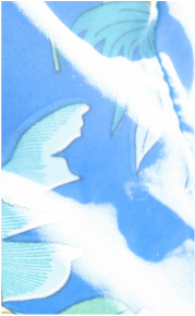
|
Overlapping
Color Theory
The Contrast Of Light And Dark
|


The Contrast Of Light Extension
Simultaneous Contrast
The Contrast Of Hue - Primaries
|
The Contrast Of Complements
The Contrast Of Hue
The Contrast Of Warm And Cool
|
